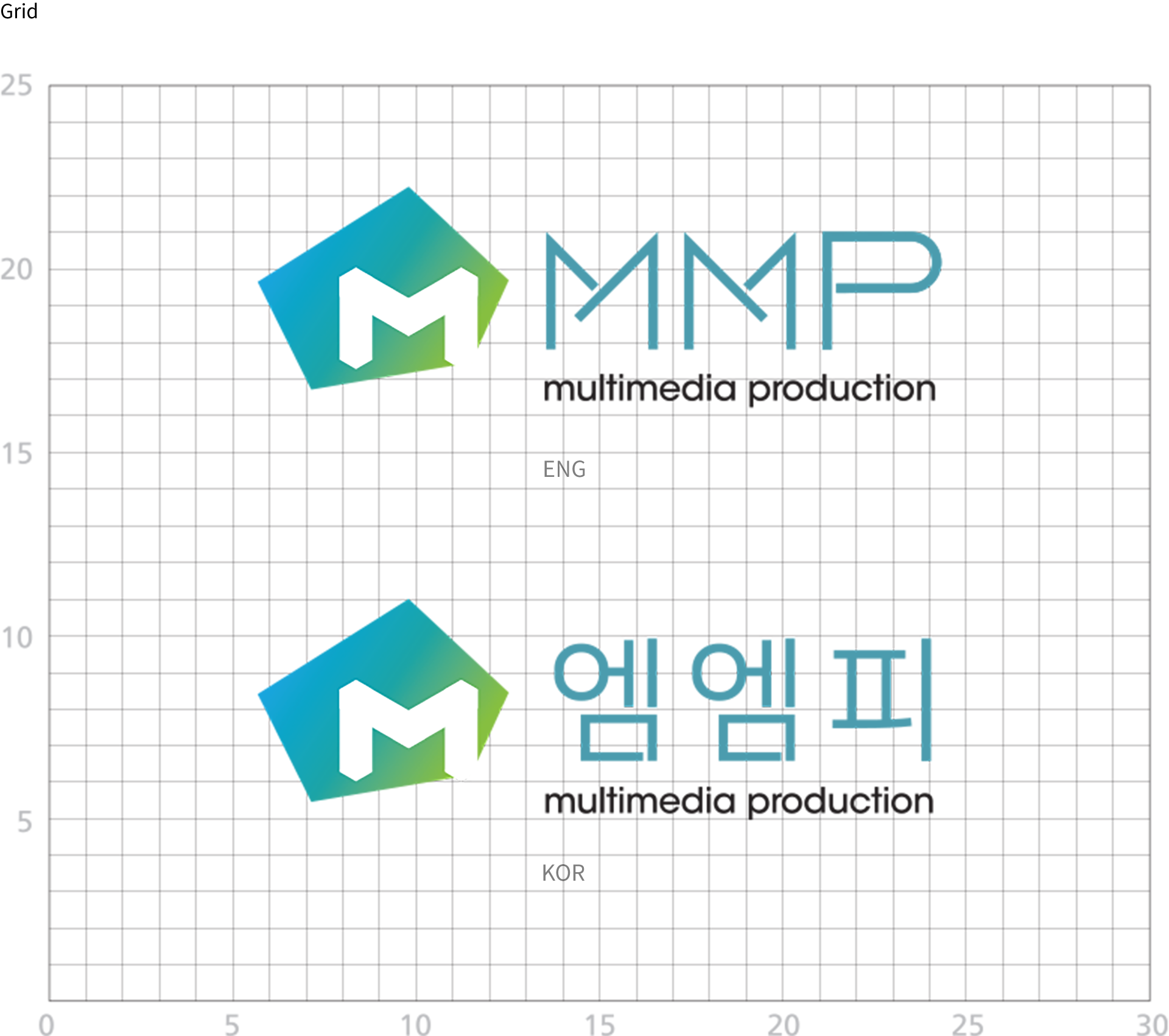
MMP has developed a Corporate Identity that visualizes the characteristics and unique nature of producing multimedia contents in a wide range of diverse fields.
Symbol mark
MMP has expressed the relationships between its members in a visual form by diversifying the concept of space through the light image seen through a camera lens on an object, combining it with the meaning of a polygonal shape and MMP's unique multimedia content. The color blue represents the youthful and sensual image of MMP, while the color green represents the growing and prosperous contents of MMP. Through the MMP gradient, we have created a professional and stable content foundation, which will enable MMP to expand further.
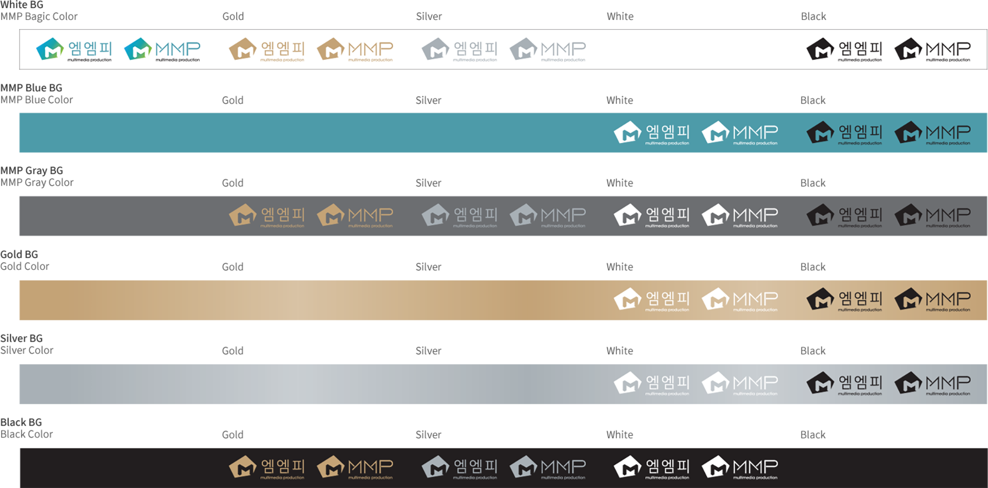
The main color of MMP is "MMP Gradient, MMP Blue", and in addition to the main color, we also use sub-colors. Sub-colors are supplementary and are used in harmony with the main color for traditional image transmission that each medium has. Color reproduction is based on each color code in this manual, and CMYK and RGB are used when using the symbol mark.
Logo Type
The logo type was designed to express the character of MMP along with the symbol mark. It cannot be modified arbitrarily, so the data is scaled proportionally for use.
Signature
A combination of symbol mark and logo type based on certain criteria, and proportion and spacing cannot be adjusted arbitrarily. It can be composed of left-right and up-down combinations, and the logo type can be omitted as needed.
Color system
The color representation is used in various printed materials, and black and white representation is used when dual-tone, negative or single-tone expression is necessary. Using color alone, it is possible to express the character of MMP through color. In addition, on a bright background, the existing color is maximized for expression, while on a dark background, changes are made to the logo type.


